Navigation Redesign

Industry
YEAR
Role
OVERVIEW
General public, donors, patients, caregivers, and healthcare professionals.
Led a responsive navigation and IA redesign across desktop and mobile
Simplified complex content structures to improve discoverability
Reorganized navigation around user intent and priority tasks
Designed scalable, accessible navigation patterns
Validated solutions through usability testing and stakeholder alignment
Created wireframes and interactive prototypes
Designed responsive UI patterns optimized for accessibility and clarity
Facilitated usability testing to improve discoverability and reduce cognitive load
Presented navigation concepts and findings to stakeholders for alignment and iteration
The existing navigation was:
Visually cluttered and inconsistent
Lacking clear hierarchy and categorization
Poorly optimized for mobile users
This led to:
High bounce rates on key content pages
Confusing, multi-step paths to critical information
Low engagement from mobile visitors
We’ve invested heavily in content, but if users can’t find it, it doesn’t matter. The current navigation is working against us.
A user-centered redesign of the mega navigation prioritizing simplicity, clear hierarchy, and mobile responsiveness by implementing intuitive labeling, logical categorization, and interactive elements to reduce cognitive load and enhance content discoverability.
Research & Discovery
We conducted heuristic audits, reviewed site analytics, and mapped content gaps to uncover key usability issues. Additional methods included stakeholder interviews, competitive analysis, and tree testing.
Users heavily relied on search due to unclear navigation
Content was siloed, hindering exploration
Existing IA lacked intuitive grouping and hierarchy
Conducted a competitive audit of leading health organizations (Mayo Clinic, CDC, WHO) and ecommerce brands known for their content-rich mega navigation, including Amazon, Nike, and Adidas. This broad analysis highlighted best practices for organizing complex content and maintaining clarity, guiding a strategic redesign that improved AHA’s navigation usability and engagement.
I conducted a thorough audit of the existing site structure, identifying gaps in hierarchy, labeling, and mobile usability. Using insights from user flows, content analysis, and stakeholder goals, I restructured the navigation to support clearer paths to critical content.
The new IA prioritized simplicity, consistency, and scalability across mobile and desktop, playing the foundation for an intuitive and engaging user experience.
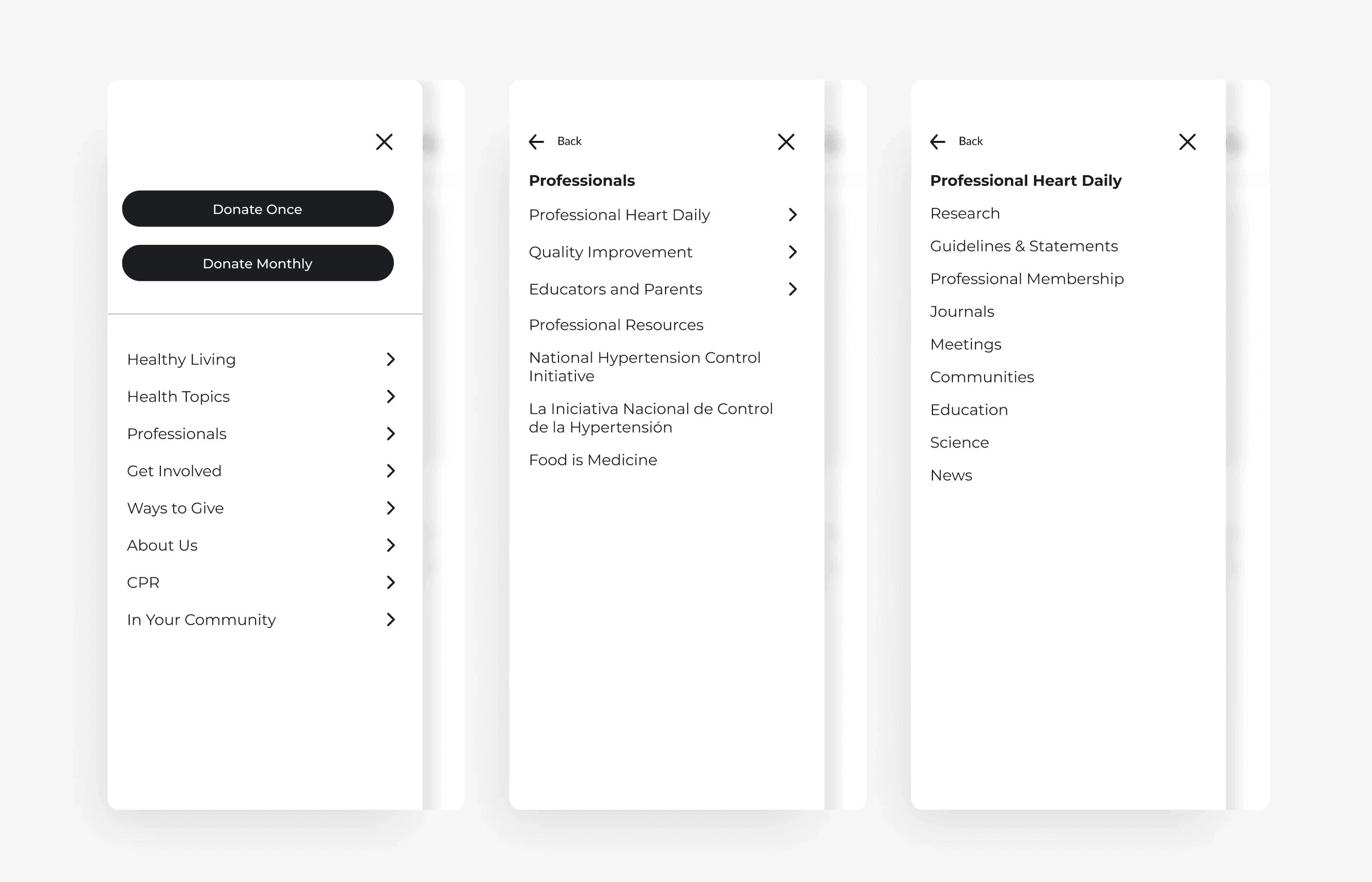
WIREFRAMES
Tested both sequential and accordion-style navigation models for mobile. While the sequential approach reduced cognitive load, it added extra taps. The final accordion solution balanced clarity and speed,preserving hierarchy while enabling quicker access to content on smaller screens.

Explored multiple desktop navigation models to balance clarity and efficiency. Sequential and hybrid waterfall layouts created friction and inconsistency, slowing down user flow.
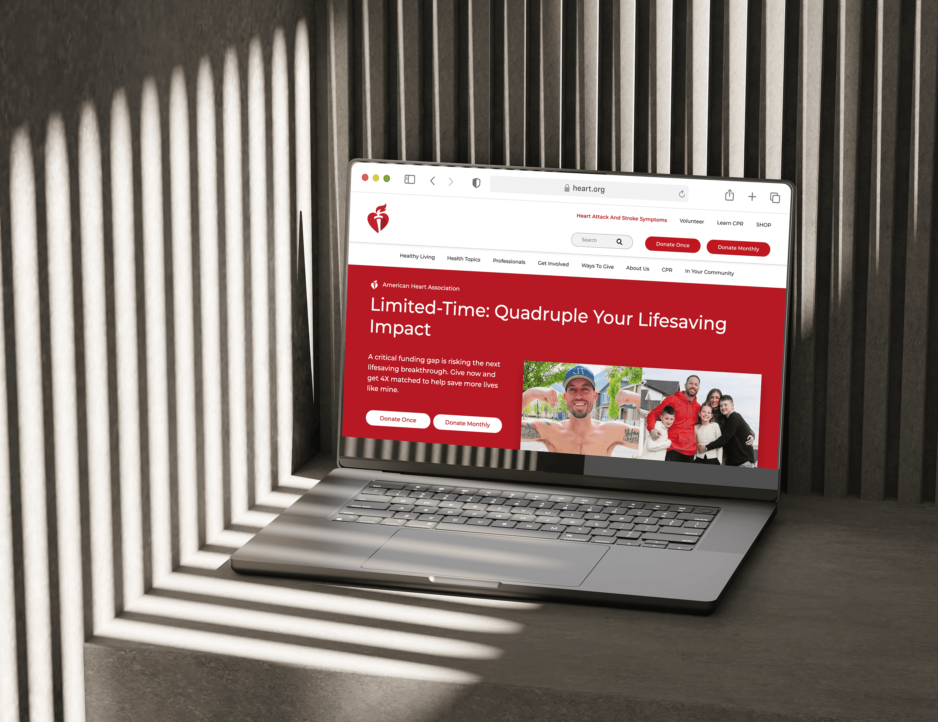
The final full mega menu enabled instant access to all categories, reduced click depth, and significantly improved content discovery.


User Feedback
User testing confirmed the redesign improved navigation, boosted user satisfaction, and enabled easier content discovery.
Design SYStem
Built a scalable, component-driven design system that translated product strategy into reusable UI patterns, ensuring consistency, faster iteration, and seamless collaboration across teams.
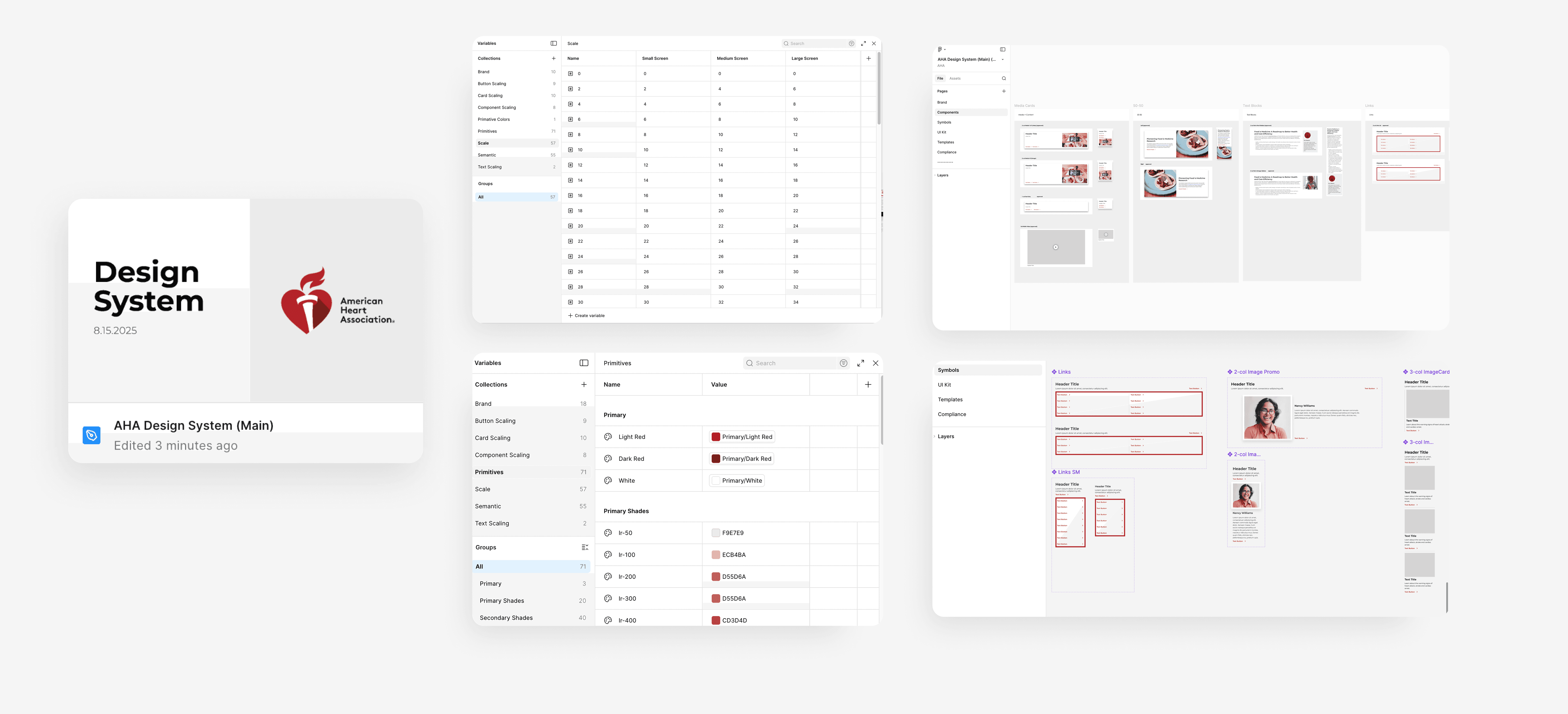
FINAL DESIGNS

Outcomes & Strategic Growth
KEY OUTCOMES
The redesign delivered measurable gains in task completion, boosted user engagement, and elevated satisfaction, creating a streamlined, intuitive experience that directly supports business objectives.
NEXT STEPS
Monitor post-launch usage to refine Information Architecture, expand audience-specific navigation personalization, and explore contextual modules, driving a more dynamic, user-centered AHA.org.